Material Design - Date & Time Picker
Material Design - Date and Time Picker
It is an independent component that lets you add the Material Design Pickers to your websites. It does rely on just Moment Js and aims to optimize for cross-device use

Looks

Note: These might not be the actual representation of the dialog at all times and so is used for visual representation only

The dialogs look like this when opened.
date-picker

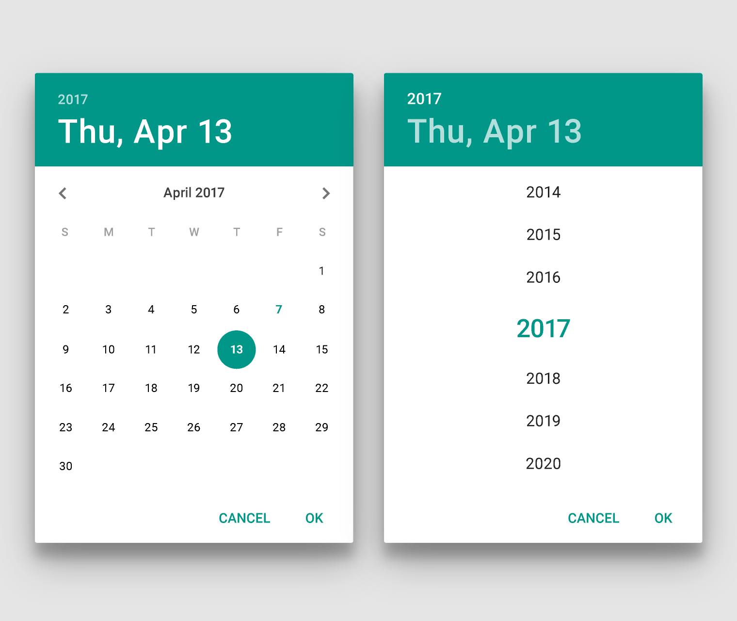
Date picker: Light theme, Teal, portrait

time-picker

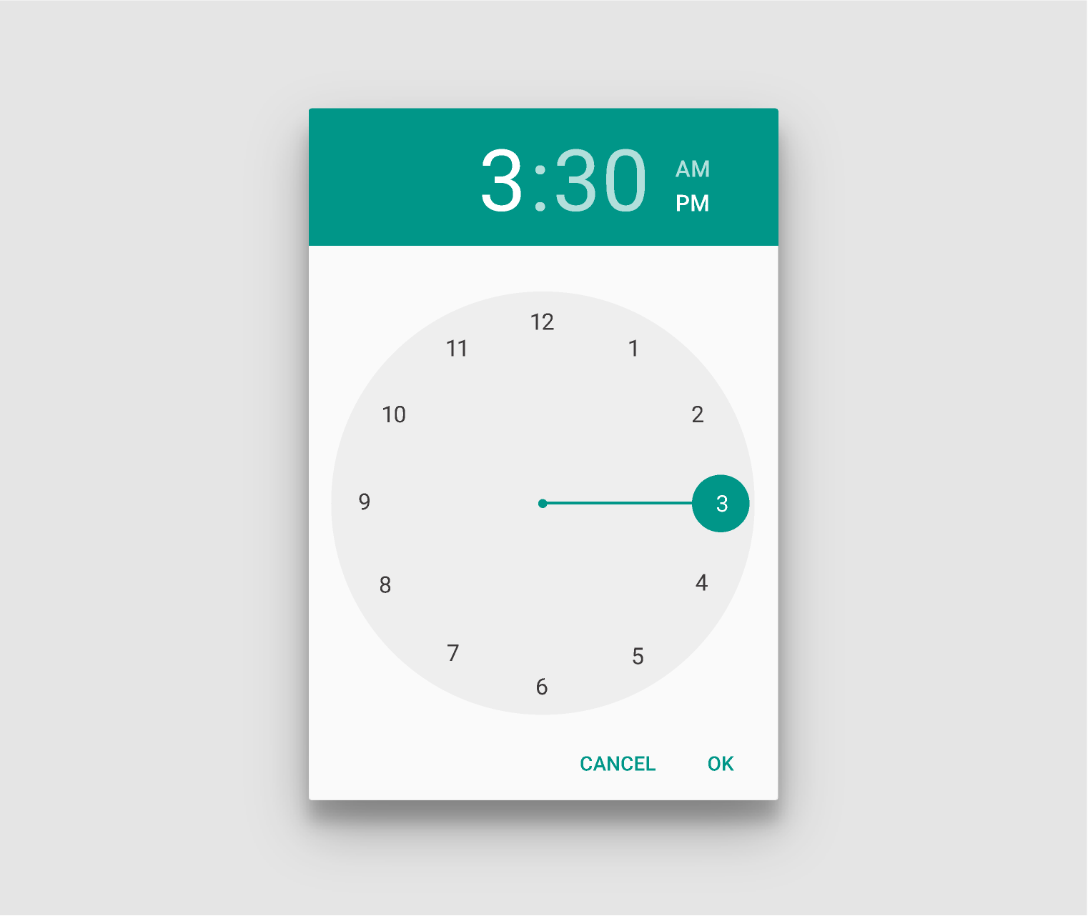
Time picker: Light theme, Teal, portrait

Features

1.Supports all material design palettes

Note: for more information on these colours refer the official spec

2.Dark Theme support (yay!)
date-picker

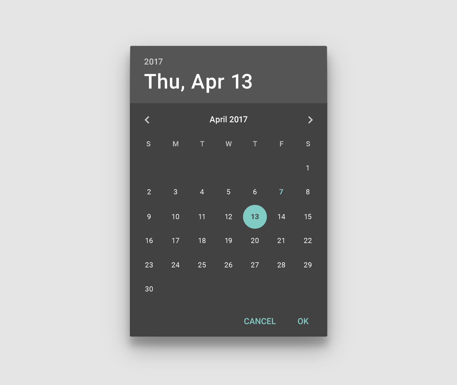
Date picker: Dark theme, Teal, portrait

time-picker

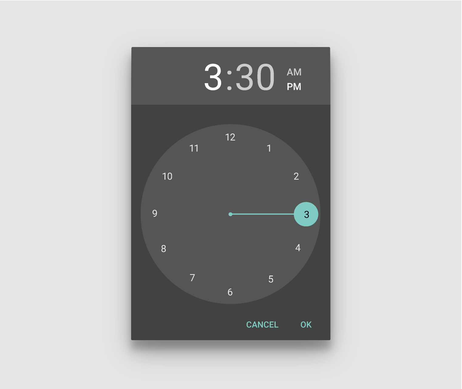
Time picker: Dark theme, Teal, portrait

3.Supports i18n infrastructure i.e works with multiple languages

Note: For a list of all locales see moment locales and to download the ones you require use moment with locales or individual ones here locales repo

Tools

This component sits on shoulders of giants and so is powered by

Examples

Here are some usage examples

              
                <link href='https://fonts.googleapis.com/css?family=Roboto:regular,bold,italic,thin,light,bolditalic,black,medium&amp;lang=en'
                rel='stylesheet' type='text/css'>
                <link rel="stylesheet" href="css/mdDateTimePicker.css">
                <script src="js/moment.js"></script>
                <script src="js/mdDateTimePicker.js"></script>


                    var dialog = new mdDateTimePicker.default({
                      type: 'date'
                    });
                    var toggleButton = document.getElementById('id-of-button-to-open-it');
                    toggleButton.addEventListener('click', function() {
                      dialog.toggle();
                    });


                    <link href='https://fonts.googleapis.com/css?family=Roboto:regular,bold,italic,thin,light,bolditalic,black,medium&amp;lang=en'
                    rel='stylesheet' type='text/css'>
                    <link rel="stylesheet" href="css/mdDateTimePicker.css">
                    <script src="js/moment.js"></script>
                    <script src="js/draggabilly.pkgd.min.js"></script>
                    <script src="js/mdDateTimePicker.js"></script>


                        var dialog = new mdDateTimePicker.default({
                          type: 'time'
                        });
                        var toggleButton = document.getElementById('id-of-button-to-open-it');
                        toggleButton.addEventListener('click', function() {
                          dialog.toggle();
                        });


For an example with umd see link

Where do i put what?

Note: Put the code as instructed by the tab heading inside the relevant html tags!

Note: Also, copy the images folder maintaining the folder structure relative to the js folder (as done in the /dist folder)

            
              <link rel="stylesheet" href="https://fonts.googleapis.com/css?family=Roboto:regular,bold,italic,thin,light,bolditalic,black,medium&amp;lang=en">
              <link rel="stylesheet" href="css/mdDateTimePicker.css">


              <script src="js/mdDateTimePicker.js"></script>


              <script>
                // your custom code here
                // initiate the component here
              </script>


Theming

Download the prebuilt and latest version of the themes from here

Note: Since, themes override the default stylesheets, so in order to use a theme just replace your previously used css and min.css files with these files.

All themes in light

Production version (mdDateTimePicker.css)
red
pink
purple
deep-purple
indigo
blue
light-blue
cyan
green
light-green
lime
yellow
amber
orange
deep-orange
brown
grey
blue-grey
teal
Release version (mdDateTimePicker.min.css)
red
pink
purple
deep-purple
indigo
blue
light-blue
cyan
green
light-green
lime
yellow
amber
orange
deep-orange
brown
grey
blue-grey
teal

All themes in dark

Production version (mdDateTimePicker.css)
red
pink
purple
deep-purple
indigo
blue
light-blue
cyan
green
light-green
lime
yellow
amber
orange
deep-orange
brown
grey
blue-grey
teal
Release version (mdDateTimePicker.min.css)
red
pink
purple
deep-purple
indigo
blue
light-blue
cyan
green
light-green
lime
yellow
amber
orange
deep-orange
brown
grey
blue-grey
teal

Basic Example

Let us begin by creating a very simple dialog. You can specify properties as key value pairs inside an object. As shown below.

          
            var dialog = new mdDateTimePicker.default({
              type: 'date'
            });


Type Argument

The type of dialog.

Note: You can declare as many dialogs in your page as you like provided that you specify the dialog type property for each one of them.

KeyValue String
typedate
time

Init Argument Optional

The currently set value of dialog or the value of dialog to begin with.
KeyValue momentDefault
initany moment object
moment()

Past Argument Optional

The past until which the dialog will render dates.

Note: The value is only relevant in case of the 'date' dialog.

KeyValue momentDefault
pastany moment object
moment().subtract(21, 'years')

Future Argument Optional

The future value till which the dialog will render dates.

Note: The value is only relevant in case of the 'date' dialog.

KeyValue momentDefault
futureany moment objectinit

Mode Argument Optional

Note: The value is only relevant in case of the 'time' dialog.

KeyValue booleanDefault
modetrue (For 24 hour mode)false
false (For 12 hour mode)

Orientation Argument Optional

Force the orientation of the picker in certain mode at initial render.
KeyValue stringDefault
orientationLANDSCAPELANDSCAPE
PORTRAIT

Trigger Argument Optional

Adds an event trigger to element for that instance of the dialog.
KeyValue elementDefault
triggerElement selector e.g document.getElementById('someElement')No element

Ok Argument Optional

Provides an interface so that the user can change the display button ok's text.
KeyValue StringDefault
okyesok

Cancel Argument Optional

Provides an interface so that the user can change the display button cancel's text.
KeyValue StringDefault
cancelnocancel

Colon Argument Optional

Provided the ability to add the colon only in the 24 hour mode
KeyDefault
colonfalse

Time Method Optional

You can get or set the current time of the dialog.

Note: Don't pass any parameters for getting the value and pass a moment to set a new date on the dialog. Also the component is not responsible for checking if the the set date is in the valid range

Here, is a usage example of get
var time = dialog.time;
Here, is a usage example of set
dialog.time = moment();

Toggle Method Optional

Toggles the display state of the dialog between open and close.
Here, is a usage example
dialog.toggle();

Trigger Method Optional

Adds an event trigger to element for that instance of the dialog.
MethodParameters
triggerElement selector e.g document.getElementById('someElement')
Here, is a usage example
dialog.trigger = document.getElementById('someElement');

onOk Event Optional

This event is dispatched on the trigger element when the ok button is pressed in the dialog.
Here, is a usage example

            // assuming test1 is an input text element
            document.getElementById('test1').addEventListener('onOk', function() {
              this.value = x.time.toString();
            });
          

onCancel Event Optional

This event is dispatched on the trigger element when the cancel button is pressed in the dialog.
Here, is a usage example

            // assuming test1 is an input text element
            document.getElementById('test1').addEventListener('onCancel', function() {
              this.value = x.time.toString();
            });
          

Custom Build Other Optional

You can tweak the entire component as and where you like. To do so,
  1. Install the relevant packages in the root of the repo using:
    npm install
  2. After successfully installing the above components, begin editing the files you want after initiating this command below.
    gulp default
  3. Note: From v1.0.0 you can also build all the themes at dist/css/themes directory using:

    gulp generate-themes

Let us help you by telling you about a few files and their usage
FileUsage
mdDateTimePicker.jsContains all of the component in es6
component.scssContains the styling for the entire component
media-portrait.scssThe overrides for portrait mode of the component
_global.scssContains the basic theme and pallette settings

Supporting Internet Explorer Polyfills

Supporting internet explorer versions 8 - 10 Requires the use of polyfills

Note: You can find a list of polyfills here at Modernizr WIki

IE versions (where required)List of polyfills to use
8 - 10classList
8 - 11CustomEvent
8 - 11scrollIntoViewIfNeeded
8Textcontent
8EventListeners

A New Feature Other

Feel free to open an issue on github.

• How the component was made.

• Why was it made.

Note: Starting from v1.0.0 the dist/css folder contains themes directory also with all themes pre-generated

Note: Starting from v1.2.0 the js files have been seperated into two builds, one for usage in global or browser window and one in UMD folder for usage with universal modules definition (amd, umd, etc.).

Note: Starting from v2.0.0 there is only one build

You can download the latest release on github
        
          npm install md-date-time-picker --save


          bower install md-date-time-picker --save